I’ve always been interested in the problem of turning noisy, messy AIS data into something genuinely useful for maritime intelligence tooling.
On paper it sounds straightforward. Ships emit positions, headings, speeds, destinations, draught and timestamps. Surely you can stitch those together into routes, aggregate some numbers, and end up with something queryable.
In practice, AIS data is chaos.
Signals are noisy. Destinations are free text. Vessels disappear for hours. GPS glitches throw ships across oceans. Sampling rates vary wildly between carriers, transponders, and coverage areas. The same vessel can report every ten seconds near shore and then disappear into a sparse stream of satellite pings halfway across the Pacific.
I’ve taken a few shots at working on this problem this over the years, usually ending somewhere between “interesting experiment” and “computationally painful dead end”.
My latest attempt has been the most promising so far.

Instead of thinking about vessels as exact paths through continuous geography, I started treating movement probabilistically. What if, rather than reconstructing perfect trajectories, we bucketed movement into spatial cells and asked simpler questions:
Where do ships spend time?
Which directions do they move through space?
What routes naturally emerge if you aggregate enough voyages?
Which transitions happen repeatedly?
The result is a global hexagonal representation of maritime movement built on Uber’s H3 spatial indexing system.
At global scale, shipping lanes start appearing almost immediately. Chokepoints light up without being manually defined. Directional flow emerges naturally. And once you start modelling transitions between cells, the whole thing begins to resemble a navigable graph of global trade.
Not bad for what started as noisy GPS pings.
What emerged from the data
Before getting into the mechanics of cleaning AIS feeds and aggregating hexagons, it’s worth showing the output first because that was honestly the most satisfying part of this project.
After spending way too many hours cleaning data, filtering junk and second-guessing assumptions, and eventually something starts appearing on the map that feels suspiciously like structure.
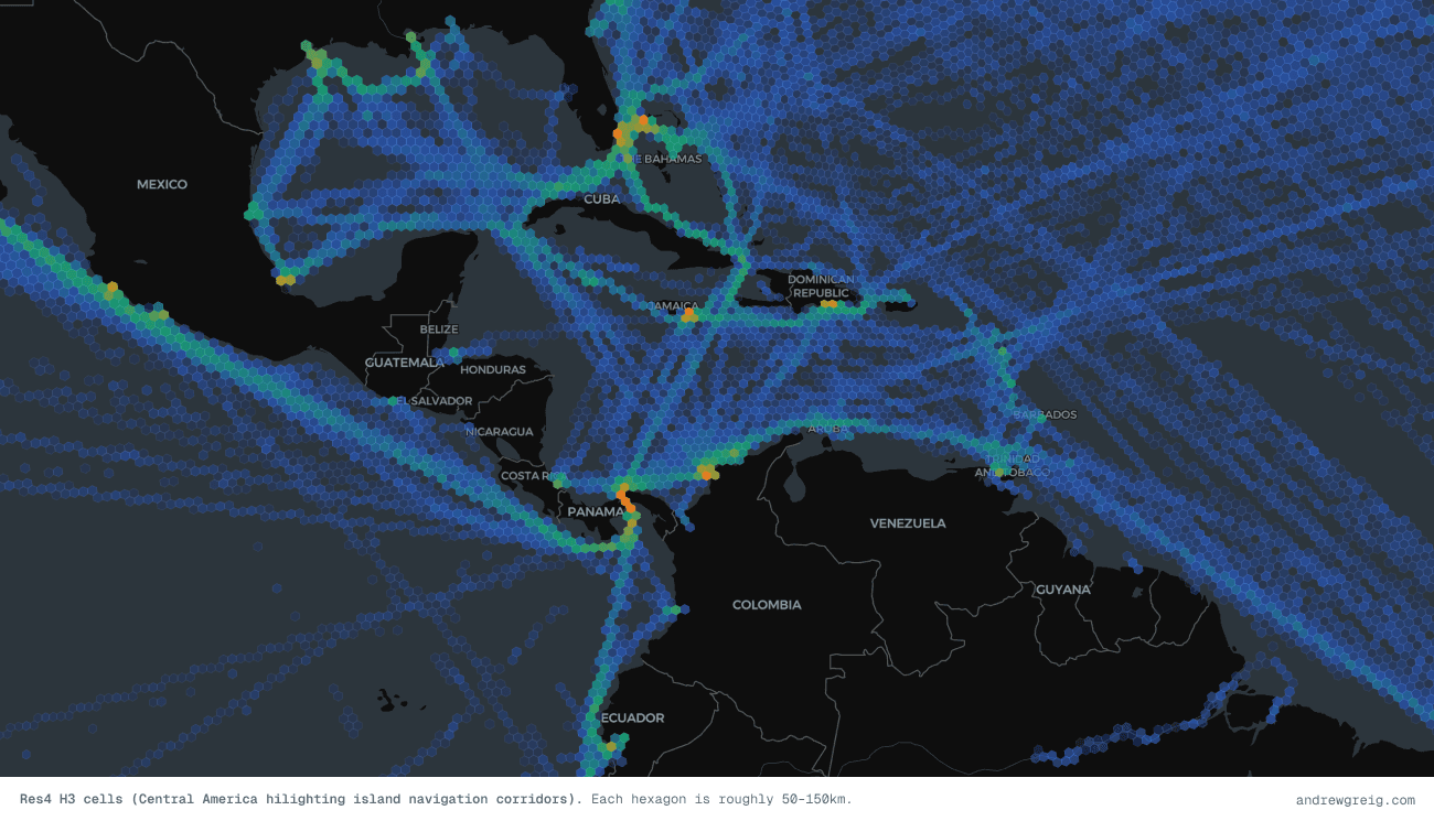
The first thing that jumped out was how clearly global shipping lanes emerge from nothing more than vessel presence.... There are no predefined routes here. No shipping-lane shapefiles. No manually encoded corridors.
Every cell simply accumulates vessel-hours, a measure of how much time vessels collectively spent inside it.
Yet the result looks strangely intentional.
The East China Sea lights up immediately. The Singapore Strait becomes impossible to miss. Traffic fans out across the Indian Ocean, converges into the Red Sea, wraps around Europe, and cuts dense channels through the English Channel and North Sea. The ocean starts looking less random and more like infrastructure.
You can almost read trade geography directly from the density map.
Chokepoints become statistically obvious
One of the first sanity checks I ran was whether known maritime chokepoints actually surfaced in the data. They did.
Not because they were manually labelled, but because ships simply spend time moving through them at scale.

The Singapore Strait and Strait of Malacca dominate immediately. The English Channel stands out. Gibraltar becomes visible. The Cape of Good Hope appears as a lower-density but still meaningful route, reflecting longer detours around Africa rather than concentrated traffic through Suez. Even secondary passages show up in roughly the places you'd expect.
| Location | Res3 Vessel-hours | Voyages |
|---|---|---|
| Strait of Malacca | 2,177 | 441 |
| Singapore Strait | 2,446 | 317 |
| English Channel | 930 | 188 |
| Strait of Gibraltar | 1,266 | 220 |
| Cape of Good Hope | 563 | 139 |
| Lombok Strait | 19 | 4 |
This quick data review confirmed that the date processing was working as expected. Its worth noting that at the time of writing this, the dataset I had access to was heavily Asia-Pacific-Oceania weighted, which becomes quite obvious once you see the output. The East China Sea, Malacca Strait, and Eastern Australian are over-represented relative to the rest of the world (especially the US which we had less data for).
The nice thing however is that the data feels directionally correct even before formal validation.I mean, if the system independently reconstructs maritime chokepoints, you’re probably doing something sensible.
Directionality emerges too
Density alone is useful, but it only tells half the story.
Knowing where ships spend time matters. Knowing how they move through space is significantly more interesting.
For each cell I computed an average flow vector: a representative direction and speed based on vessel movement through that region. At first I thought this might end up noisy or visually messy. Instead, the results were surprisingly readable.

This image from the Tasman sea between New Zealand and Australla highlights the ver clear circular vessel patterns as they run their service loops. We see other patterns emerging such as traffic through the English Channel forming a clear east-west directional split. Movement from Singapore to China becomes highly structured. Major corridors start behaving like vector fields. You stop looking at a map of “where ships are” and start looking at a map of “how shipping moves”.
That distinction matters because movement contains signal. Wrong-way movement becomes obvious. Divergence from expected routes becomes visible. Certain corridors develop strong directional confidence while others remain diffuse and exploratory.
It starts feeling less like dots on a map and more like a behavioural system.
Resolution changes the story
One thing I quickly discovered was that no single spatial resolution works globally. At large scale, detailed cells become visual noise. At small scale, coarse cells erase useful structure. This is where H3 gets interesting.
I ended up using two resolutions:
Res3 for global and ocean-scale movement
Res4 for coastal and regional detail
Res3 cells cover roughly 200–500km depending on latitude. Good for ocean corridors.
Res4 tightens things considerably into roughly 50–150km buckets, which starts surfacing coastal approaches, port systems and denser routing behaviour.
Zooming between them felt surprisingly natural. At global scale you get structure. Zoom in again and the detail sharpens without changing the underlying model.
Why AIS data is such a mess
Of course, before any of this becomes useful, you first have to survive AIS.
AIS (Automatic Identification System) is the transponder network vessels use to broadcast location, heading, speed and metadata. Every sufficiently large commercial vessel runs it.
In theory this sounds clean... It really isn’t.
The reality of AIS data looks more like this:
Duplicate pings. The same position broadcast gets picked up by multiple receivers and ends up in the dataset twice (or ten times).
Noisy data. Ships drift at anchor. Tug manoeuvres generate tiny positional shifts. Port movement becomes a mess of micro-adjustments.
Position jumps. A vessel appears 200 nautical miles away three seconds later and then snaps back into place.
Speed outliers. Ships physically cannot exceed about 30 knots. The raw data often contains vessels doing >400 knots!
Missing voyages. Vessels go "dark". Either intentionally (spoofing) or because they left satellite coverage (ie while in the middle of the Pacific Ocean). You get gaps of hours or days.
Wildly inconsistent sampling. One vessel reports every 10 seconds. Another every 45 minutes.
If you aggregate this raw, the map becomes nonsense. You need to clean aggressively.
Cleaning and voyage segmentation
Most of the cleaning was straightforward filtering.
Deduplicate approximate coordinates
Drop impossible speeds
Remove invalid positions
Filter incomplete metadata
Ignore extremely sparse voyages
One useful trick was quantising coordinates during deduplication.
Instead of comparing floating point positions exactly, coordinates get rounded into approximate buckets. Tiny drift from anchored or slow-moving vessels stops inflating counts.
Voyage segmentation turned out to be easier than expected. I was lucky as my dataset already included origin port, destination port and departure time. That meant segmentation became a group-by problem rather than inferring voyages through heuristics.
df = df.with_columns(pl.concat_str([pl.col("imo").cast(pl.String),pl.col("origin_locode"),pl.col("destination_locode"),pl.col("atd").cast(pl.String)],separator="|",).alias("voyage_id"))
Each unique `(imo, origin, destination, departure_time)` tuple becomes a voyage ID. Legs with fewer than 5 positions are dropped. They carry too little signal to be useful. This is important: you don't want a vessel that reported twice in the middle of the ocean distorting your density counts.
Why H3?
Once the data was clean, the next question became:
What spatial structure should this live on?
I landed on the H3 library.
Uber originally built H3 for ride-sharing and logistics problems, but it turns out maritime movement maps onto it surprisingly well.
Hexagons have a few nice properties. Neighbour relationships stay uniform. Every cell has six neighbours at consistent distances, unlike square grids where diagonals behave differently. The hierarchy is built in. You can cleanly move between resolutions.
And converting coordinates becomes trivial:
import h3cell = h3.latlng_to_cell(lat, lon, resolution=3) # → '831b34fffffffff'
That one line turns geography into something indexable.
Every AIS ping becomes a cell ID. The interesting work starts after that.
Turning points into signals
Once every AIS ping becomes an H3 cell, the problem shifts from geography to aggregation.
You are no longer dealing with millions of floating coordinates. You are dealing with repeated movement through discrete regions of space.
The obvious first metric is simple density. But density by itself is misleading.
If Vessel A reports every 10 seconds and Vessel B reports every 45 minutes, naïvely counting pings heavily overweights one vessel purely because of reporting frequency.
What you actually want is time spent. So instead of counting positions, I compute vessel-hours per cell.
For every voyage, consecutive AIS positions are paired together and the time delta between them is measured. That time gets credited to the originating cell. So a vessel that spent four hours transiting a region contributes four hours of signal. A vessel that briefly clips a cell contributes far less.
This turns out to be a much better proxy for traffic intensity.
1df = df.with_columns([2 pl.col("h3_index").shift(-1).over("voyage_id").alias("next_h3_index"),3 pl.col("reported_at").shift(-1).over("voyage_id").alias("next_reported_at"),4])56df = df.with_columns(7 ((pl.col("next_reported_at") - pl.col("reported_at"))8 .dt.total_seconds() / 3600.0)9 .alias("time_delta_hours")10)1112# Drop tracking gaps — not continuous travel13df = df.filter(14 (pl.col("time_delta_hours") > 0) & (pl.col("time_delta_hours") <= 3.0)15)
There is an important caveat here. AIS gaps matter.
If a vessel disappears for eight hours and then reappears, you probably should not assume it spent eight hours sitting inside the previous cell. That introduces fake congestion and distorts flow. So I deliberately cap gaps and anything above three hours gets discarded.
Three hours is not a magic number. It just felt like a reasonable compromise between preserving continuity and avoiding nonsense. Large satellite gaps, port stops, outages and dark periods stop polluting the signal.
What remains feels much closer to actual movement.
Once aggregated, each cell ends up with useful metrics:
vessel-hours
voyage count
average speed
dominant movement direction
Suddenly the grid starts becoming informative rather than descriptive.
The hidden shipping network
This is where things became unexpectedly fun. Whilst density maps are nice. Flow vectors are nicer.
But the really interesting output ended up being transitions between cells. For every voyage, I record movement between consecutive H3 cells: from_cell → to_cell. Then count how often those transitions occur. Over enough voyages, this becomes a weighted directed graph.
cell_a → cell_b (92%)cell_a → cell_c (7%)cell_a → cell_d (1%)
Suddenly maritime movement stops looking like GPS traces and starts resembling probabilities.
Given a vessel in a cell, what is the most likely next movement? Which routes naturally emerge? Which transitions almost never happen?
Shipping lanes start revealing themselves without anyone explicitly modelling them. That part surprised me. There are no hand-authored corridors here. The data simply accumulates enough evidence that structure appears. You can think of it like latent infrastructure.
The routes already existed in the behaviour. We just surfaced them.

This example of the Pacific Ocean at H4 resolution reveals the major China–US trade corridor and how strongly global shipping is shaped by great-circle routing on a spherical Earth. Rather than following straight lines on a flat projection, vessels naturally converge onto curved shortest-path routes, which makes the dominant Pacific traffic arc northward. This creates a dense band of movement passing just south of Alaska through the Aleutian Islands before turning back down toward East Asia, including Japan and China via routes near Hokkaido.
Rendering it on a map
The canonical store for all of this is Parquet. Compact, columnar, fast to query. Unfortunately, browsers do not speak Parquet. Map rendering still wants polygons.
So the final step converts each H3 index into a GeoJSON polygon using cell_to_boundary().
1boundary = h3.cell_to_boundary(2 row["h3_index"]3)45coordinates = [6 [lon, lat]7 for lat, lon in boundary8]910coordinates.append(11 coordinates[0]12)
A consistently annoying edge case appears around the anti-meridian (as it always does). Cells crossing the 180° longitude line can wrap badly if coordinates are not normalised properly. Map rendering near the Pacific becomes a real mess very quickly.
After export, GeoJSON gets loaded into MapLibre GL and rendered as layered fills.
Colour ramps represent vessel-hour density.
Flow vectors render separately.
Resolution switching happens automatically with zoom.
At world scale, Res3 dominates.
Zoom in and Res4 fades into place.
The nice thing about this approach is that the frontend logic stays fairly dumb. Most of the intelligence lives in the preprocessing. The browser mostly just visualises decisions already made.
What this actually enables
At this point the obvious question becomes: Cool map, now what? A few things immediately fall out of the data.
Congestion and density heatmaps. The vessel-hour metric is already a congestion signal. High-density cells relative to neighbours usually indicate constrained movement. A live AIS feed would make this even more useful. Instead of historical density, you could compute rolling congestion. Example: If the Suez Canal blocks again, rerouting pressure around the Cape of Good Hope becomes visible almost immediately.
Shipping lane discovery. The transition graph is effectively a route network. Run pathfinding across weighted transitions and routes emerge naturally. Instead of manually authored sea lanes, you infer where ships actually travel. The lanes become evidence-based.
Pathfinding. If a vessel is here and heading toward Singapore, what route will it likely take? The transition graph becomes queryable. Historical behaviour starts acting as prior probability. That opens interesting possibilities around ETA modelling, voyage inference and anomaly detection.
Anomaly detection. Rare movement becomes measurable. A vessel entering historically sparse cells is unusual. Transitions that almost never occur become suspicious. Wrong-way flow becomes obvious.
You stop asking "where is this ship?" and start asking "does this behaviour fit historical expectation?"
Port pressure and dwell time. Cells near major ports naturally accumulate waiting behaviour. Anchorage congestion starts surfacing. Port approaches become measurable systems rather than anecdotal operational pain.
The thing I found most satisfying about this project is how much structure was already latent in the raw data.
You do not manually define shipping lanes, they naturally emerge from counting carefully and in a coordinated way. The H3 grid is just a sensible bucket to pour the counts into, and the transition pairs are just the natural next step after you've assigned each ping to a cell.
The hard parts were the boring ones: deduplication, gap handling, the circular mean trick for bearings. The interesting structure came for free once the data was clean.
H3 doesn't get talked about much outside of ride-sharing and delivery logistics contexts, but it's a genuinely useful primitive for maritime and geospatial work. If you're doing anything with vessel tracking, weather data, or any other phenomenon that needs a global spatial index, it's worth a look.
Backend code is written in Python, using Polars for the dataframe work and the h3-py bindings for cell operations. The frontend renders via MapLibre GL JS.